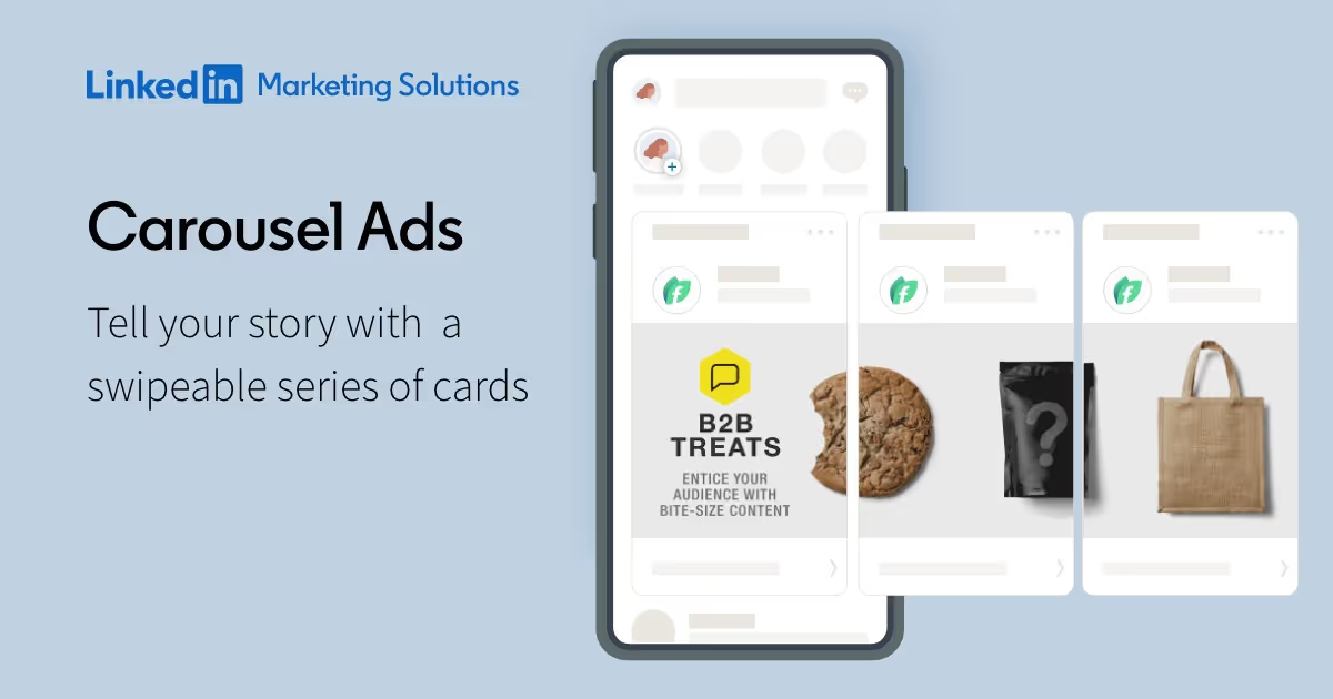
Linkedin carousel: methods and tips to create it easily
The Linkedin carousel stimulates the engagement of your audience. But how do you design one that is efficient? Here are our tips for creating a carousel.

LinkedIn is much more than just a social network: it is a great digital marketing tool that increases visibility among future potential customers. LinkedIn is a platform that connects professionals. Through their publications and profiles, they build relationships and promote their businesses. One of the many features of this network is the LinkedIn carousel, ideal for sharing information, news and highlighting your brand or business, while stimulating the engagement of your audience.
This publication method, offered by the main BtoB prospecting platform, is easy to use. However, few people use them frequently. This is often due to limited familiarity with LinkedIn's carousel function. So how do you design one that is efficient? Here are our tips for creating a LinkedIn carousel.
Linkedin carousel: definition
The LinkedIn carousel consists of a series of images, enhanced with text, that are revealed on your news feed. This visual format is used to communicate effectively to your audience, whether for:
- announce a special offer,
- introduce a new service,
- or simply highlight your brand and its strengths.
It is similar to a slideshow in which you can integrate different visuals to be browsed horizontally. LinkedIn isn't the only platform that offers this option: carousels are also popular on Facebook and Instagram. This format is a great alternative to videos.
Linkedin Ads carousel and free Linkedin carousel: what is the difference?
It is essential to differentiate between these two digital approaches, as they vary greatly in terms of reach and effectiveness in acquiring new customers.
Anyone can create a LinkedIn carousel without necessarily launching an advertising campaign.
The main distinction between these two types of carousels lies in their distribution. One appears on your news feed, while the other has a wider reach because it's an ad.

When considering launching a LinkedIn Ads campaign, it is important to understand that there are associated costs. The CPC (cost per click) is €2, with a minimum daily budget set at €10. As with any form of publicity paid, effectiveness depends largely on the size of your advertising budget. Your carousel LinkedIn Ads is displayed on the news feed of the prospects you have specifically targeted.
Why create a Linkedin carousel?
Carousels are growing in popularity on LinkedIn. Many users see a marked improvement in the reach and visibility of these publications, compared to image galleries or traditional written posts. An analysis of the LinkedIn algorithm supports this observation. This is largely attributed to “Dwell Time”: the more time a user spends on a post, the more visibility the LinkedIn algorithm will give it.
When it comes to effectiveness, presenting ideas or projects through a carousel is much more engaging than a long paragraph. It is actually easier to absorb and remember a series of clear and concise slides than a dense 3,000 character post. It's also a much more engaging and interactive way to promote a product, service, or idea.
The steps to create a Linkedin carousel
LinkedIn is in the process of gradually introducing a feature to create image carousels directly in the application, but this option is not yet available.
For the moment, the creation of Linkedin carousels is only possible via a PDF file. Here are some key steps for creating an effective carousel.
Prepare a PDF
LinkedIn only supports this format for creating a carousel. Each page of your PDF will turn into a carousel slide. Use tools like Canva or Figma to design your images.
We suggest that you use Canva, a tool that we have already mentioned on this blog and that fits this need perfectly.
If you already have an account, sign in. If not, create one by clicking on the “Register” option at the top right. Canva offers a free version that will easily allow you to create a carousel for LinkedIn. After accessing your main page, simply click “Create Design” and then select “Custom Dimension.”

Enter 1080 for the width and 1080 for the height (in pixels). This is the recommended format. Then click on “Start a new design.”
A new tab is displayed, showing you the graphical design interface for your upcoming project.
Each slide should be developed individually. Each slide actually corresponds to a page of your upcoming document. When you're done with your first slide, you can start another one by pressing the add page icon. If you want to reuse the graphic elements from the previous slide, use the duplicate page icon.

Once you have completed your carousel, download it. Press the “Share” button at the top right, followed by “Download.” Choose the “standard PDF” format and click “Download” to finalize.
Select a PDF creation software
Once your visuals are ready, merge them into a single PDF. Tools like PDF Studio or Adobe Acrobat Pro can help.
Make sure your PDF doesn't exceed 10MB or LinkedIn won't accept it.
Share your carousel
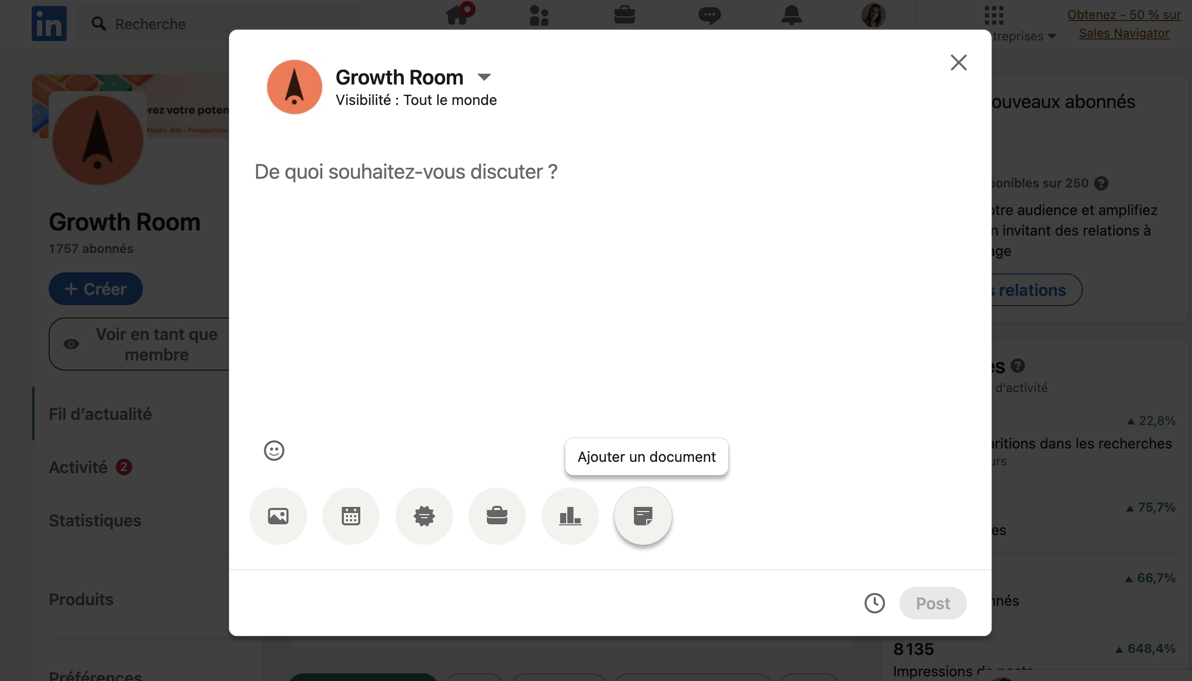
- On the website: Click on “Start a post” then select “Add a document”, symbolized by a sheet icon. If you don't see this option, click on the three dots to see all the publishing options.
- On the mobile app: Press the “+” or “Post” button at the bottom of the main screen. Select “Add Document” or the sheet icon, then upload your PDF.

Finally, name your document correctly and add a short introduction to your post before publishing.
By following these steps, whether you're on desktop or mobile, you'll be able to effectively share a carousel on LinkedIn.
6 best practices for a successful Linkedin carousel
The format of the images
As long as the document is consistent, the options are varied. However, the portrait format has become common on LinkedIn, such as A4 (21×29.7 cm) or 1080×1350 pixels. The square format (1080×1080 pixels) remains a valid alternative because it is suitable for all devices.
The length of the carousel
A carousel should be concise, with 5 to 10 relevant slides to maintain audience interest and attention.
The quality of the visuals
Each carousel slide must be of high quality, just like the images on each page of the PDF. An inaccurate or low-resolution image will discourage the user and damage the credibility of the author of the document.
The identity of the document
It is essential to create a document that reflects who you are, representing the style and spirit of the creator. This will facilitate your immediate recognition by the public.
The importance of the first image
The first slide of the carousel should immediately catch the reader's attention thanks to a compelling title and image.
The primacy of efficiency and clarity
Clean, straight to the point slides with the minimum amount of text required are essential. Beautiful visuals, appropriate typography, highlighting key points, and adding a few emojis can go a long way in making a LinkedIn carousel successful.
User support
Even though LinkedIn shows arrows when hovering to indicate the presence of multiple slides in the carousel, it may be a good idea to incorporate navigational incentives, such as arrows or a pagination hint.
The importance of interaction
Encourage readers to engage by using calls to action (CTAs). At the end of the presentation, remind them to follow your profile, share, like, or comment on your post.
.svg)
